Components
Here you can find a list of all the components which are exported by the @trueberryless-org/starlight-plugins-docs-components package. These components are automatically used in the three injected routes /resources/sites, /resources/plugins and /resources/hiddeoo but you can also use them manually.
ResourcesIntro
Section titled “ResourcesIntro”The ResourcesIntro component is used to introduce the resources section. It centralizes the management of the introduction content, so it only needs to be changed in one place.
import ResourcesIntro from "@trueberryless-org/starlight-plugins-docs-components/components/ResourcesIntro.astro";
<ResourcesIntro />;Plugins can customize Starlight configuration, UI, and behavior. Check out the Starlight Plugins and Integrations showcase for a list of available plugins.
You can find all the Starlight plugins, components, tools, themes and blog-posts we developed in the list below.
Resources
Section titled “Resources”The Resources component is used to display all resources of a specific type. The type property is one of the keys of the raw JSON data.
import Resources from "@trueberryless-org/starlight-plugins-docs-components/components/Resources.astro";
<Resources type="plugins" />;ResourcesList
Section titled “ResourcesList”The ResourcesList component is used to display all resources of all types with the keys as headings. It can be useful when you want to display all resources in a list but you don’t want to list all the types manually.
import ResourcesList from "@trueberryless-org/starlight-plugins-docs-components/components/ResourcesList.astro";
<ResourcesList />;Plugins
Components
Tools
Themes
Blog Posts
ShowcaseIntro
Section titled “ShowcaseIntro”The ShowcaseIntro component is used to introduce the showcase section. It centralizes the management of the introduction content, so it only needs to be changed in one place. Each introduction of the showcase page has its own “Call to action” text and href property, which is used to link to the source code of the showcase page.
import ShowcaseIntro from "@trueberryless-org/starlight-plugins-docs-components/components/ShowcaseIntro.astro";
<ShowcaseIntro cta="Have you built a website using YOUR_PLUGIN?" href="https://github.com/trueberryless-org/YOUR_PLUGIN/edit/main/docs/src/content/docs/showcase/sites.mdx"/>;Showcase
Section titled “Showcase”The Showcase component is used to display a list of showcase entries. These entries have to be listed manually in the entries property via JSON syntax.
import Showcase from "@trueberryless-org/starlight-plugins-docs-components/components/Showcase.astro";
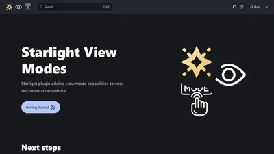
<Showcase entries={[ { thumbnail: import("../../assets/showcase/starlight-sidebar-topics-dropdown.png"), href: "https://github.com/trueberryless-org/starlight-sidebar-topics-dropdown", title: "starlight-sidebar-topics-dropdown", }, { thumbnail: import("../../assets/showcase/starlight-view-modes.png"), href: "https://github.com/trueberryless-org/starlight-view-modes", title: "starlight-view-modes", }, ]}/>;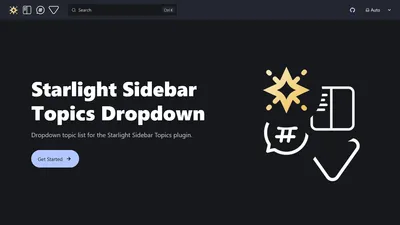
Raw JSON Data
Section titled “Raw JSON Data”Here is the raw JSON data for all the components listed above. It’s stored in a GitHub Gist, so that every plugin can use it. You can find the Gist here.
{ "plugins": [ { "name": "Starlight View Modes", "description": "Add view mode capabilities to your documentation website.", "url": "https://starlight-view-modes.trueberryless.org/" }, { "name": "Starlight Cooler Credit", "description": "Add a nice credit to Starlight or Astro at the bottom of Table of Contents.", "url": "https://starlight-cooler-credit.trueberryless.org/" }, { "name": "Starlight Plugin Show Latest Version", "description": "Show the latest released version of your package in your documentation.", "url": "https://starlight-plugin-show-latest-version.trueberryless.org/" }, { "name": "Starlight Sidebar Swipe", "description": "Make sidebar swipeable on mobile devices like Discord Mobile.", "url": "https://starlight-sidebar-swipe.trueberryless.org/" } ], "components": [ { "name": "Starlight Sidebar Topics Dropdown", "description": "Dropdown topic list for the Starlight Sidebar Topics plugin.", "url": "https://starlight-sidebar-topics-dropdown.trueberryless.org/" }, { "name": "Starlight Contributor List", "description": "Display a list of all contributors to your project.", "url": "https://starlight-contributor-list.trueberryless.org/" }, { "name": "Starlight Save File Component", "description": "Quickly display a link to some download asset on your Starlight site.", "url": "https://starlight-save-file-component.trueberryless.org/" } ], "tools": [ { "name": "Starlight Plugin Translations", "description": "View the translation status of Starlight plugins which add UI translation strings.", "url": "https://starlight-plugin-translations.netlify.app/" } ], "themes": [ { "name": "Starlight Theme Next.js", "description": "Starlight theme inspired by the Next.js docs.", "url": "https://starlight-theme-next.trueberryless.org/" }, { "name": "Starlight Theme Rosé Pine", "description": "Soho vibes for Starlight.", "url": "https://starlight-theme-rose-pine.trueberryless.org/" } ], "blog-posts": [ { "name": "Progress Indicator", "description": "Learn how to create a horizontal progress indicator for your Starlight site.", "url": "https://blog.trueberryless.org/blog/starlight-progress-indicator/" }, { "name": "Sidebar Whitespaces", "description": "How small changes can make a big difference when it comes to whitespaces, font sizes, weights, and colours in your Starlight sidebar.", "url": "https://blog.trueberryless.org/blog/starlight-sidebar-whitespace/" }, { "name": "Autogenerate Whole Sidebar", "description": "Learn two Starlight techniques to autogenerate large sidebars while keeping clean URLs and labels.", "url": "https://blog.trueberryless.org/blog/starlight-autogenerate-whole-sidebar/" }, { "name": "Topics: Dropdown and List together", "description": "Learn how to combine a desktop list and mobile dropdown for your Starlight sidebar topics.", "url": "https://blog.trueberryless.org/blog/starlight-dropdown-and-list-together/" }, { "name": "Customize Table of Contents \"Overview\" Title", "description": "Learn how you can customize the first heading in the right sidebar of every Starlight page globally and individually.", "url": "https://blog.trueberryless.org/blog/starlight-customize-toc-overview-title/" } ]}